Tony Tweedy carpentry & joinery
For this project I asked Dad if he would be willing for me to update his brand, lucky he said yes and I was talked to create a new logo, paper work to go along with the logo work as well as concepts of a possible website and social media.
Development stage
Idea stage
When designing I had a few ideas on what the logo could look like and started to do a few rough ideas on sticky notes like a spider-gram to help me generate a few ideas. Where I started was the letter ‘T’ and that kind of gave me ideas on how I could represent that letter and that led me down different ideas. The client did also have a few ideas on what he might like the logo to look like and thought about having a house with the letter ‘T’ in it. I did experiment with this idea but when look into the the idea further I found there where many different logos that had housing. I thought that having it could be misleading to what the client wanted. I did again talk to the client about what kind of tools he uses as well as what tools are recognisable by anyone within the trade. I was think by designing the logo to reflect the carpenters tools and have keeping ‘Tony Tweedy carpentry & joinery’ I could have a connection to people who are looking to hire my client as well have other people who work within the trade business see that my client is familiar with the tools that a carpenter needs. Furthermore, when designing these rough logos I want to try different styles of logo like just having a typography logo or a illustrative approach to the logo but what I found was best was having a mix both as it made it more clear into what the client does.
Original Logo
With the original logo the client had made it himself using Microsoft Word. When talking to the client about the logo there wasn’t any real resining he said to why he styled the logo like this and didn’t have much of an attachment to the current design. He wanted to have a redesign of the logo so that it would represent his business more professional as well as be more related to what the client does. The client did want to keep his branding colours of green and dark grey as he liked them together and that he has used them for over ten years.
After coming up with more rough ideas I took three designs that came off the orignal idea that the client came up with and then I took one that I thought the client might like but this idea would be more unique to what the client has asked for.
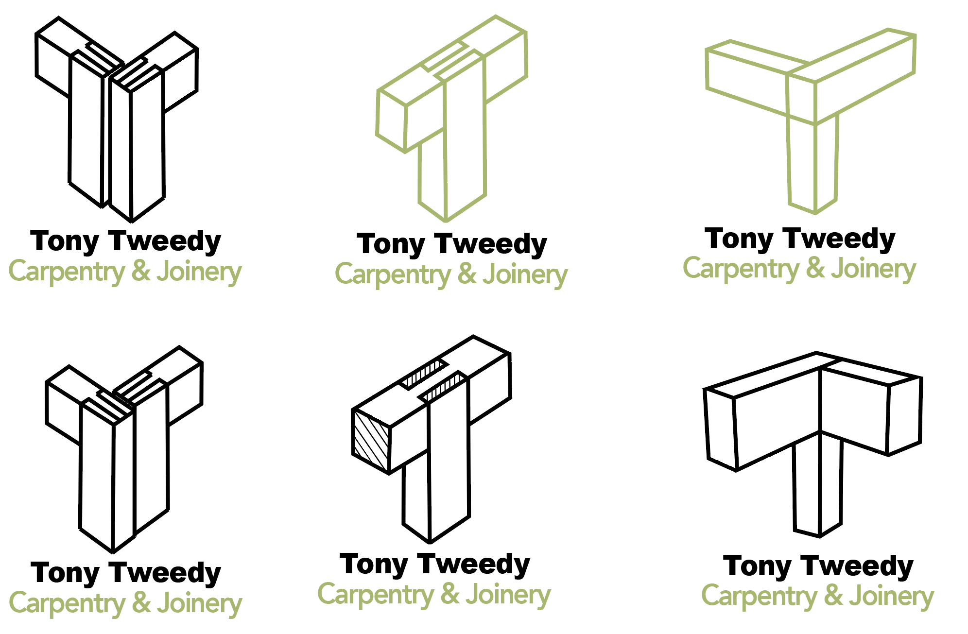
After coming up with a lots of design that were further developed the client liked my idea more than the ideas that he proposed. With my design I decided to create the ‘T’ by making it look like a joint of wood coming together forming the letter ‘T’ . With this idea I looked into different joints that can be done to create the illusion of a ‘T’ because some of the concepts that I made it look like a ‘V’ or a ‘Y’ so it was a little difficult to come up with a design that looked like a ‘T’ and was an actually joint that carpenters use.
Finale product
After a few more rounds of development and conversations with the client I managed to come up with a design that the client really liked and represented what he does.


